- November 2nd, 2009, 4:32 pm
#282498
1990

1994
 or
or 
1998

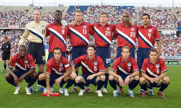
2002

2006
 or
or 
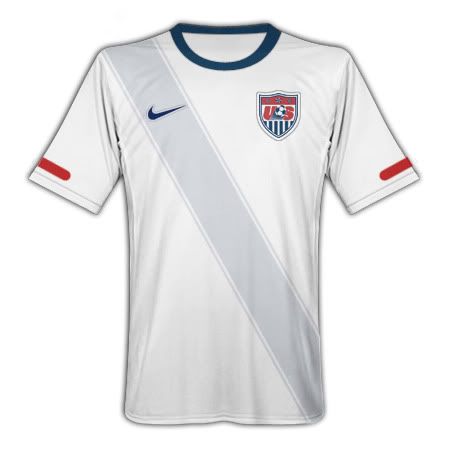
2010
 or
or 
DTOM 2005 (I think)
 or
or 
Misc. A (2000 maybe?)

Rank them in order. I'm not 100% sure the time periods on these are correct. It seems like they go through uniforms so quickly and sometimes they were worn during non WC years it's hard to tell what was when
1994
or 1998
2002
2006
or 2010
or DTOM 2005 (I think)
or Misc. A (2000 maybe?)
Rank them in order. I'm not 100% sure the time periods on these are correct. It seems like they go through uniforms so quickly and sometimes they were worn during non WC years it's hard to tell what was when
*please disregard this post if dated before 2017 and accept my apologies*


 - By Chippy
 - By Purple Haize
 - By cruzan_flame13