

If you want to talk ASUN smack or ramble ad nauseum about your favorite pro or major college teams, this is the place to let it rip.

Moderators: jcmanson, Sly Fox, BuryYourDuke

By Knucklehead
Registration Days Posts
#132286
prototype wrote:
SuperJon wrote:I've never seen "eagle made of flames" in our logo. It's not a bad looking logo. I'm just not a huge fan of it.

Image

Does this help?
Hey I really like the flaming one with the blue type.
By SuperJon
Registration Days Posts
#132287
Proto, please don't take what I've said as me not liking the logo because I do. I just feel as though there needs to be a secondary logo for other uses since it's hard to scale down our logo and put it on things other than white.
User avatar
By RubberMallet
Registration Days Posts
#132289
Hold My Own wrote:Our logo is the best in the Big South...it's creative, edgey as well as something that can be taken into the future and wont be outdated
it is outdated
User avatar
By prototype
Registration Days Posts
#132290
Knucklehead wrote:
El Scorcho wrote:
Knucklehead wrote:Sounds like we are going another direction on this thread, so I'll kick the ball and roll it faster. I'm hearing a lot that don't like our logo (I like it btw). So:
What would you like to see?
Should we keep being the flames?
Is it cool to be the flames and yet have an eagle as a mascot?

Personally I think the big deal would be to come up with one thing and brand it like crazy. I hate that the school, athletics, alumni etc. have so many different logos and looks. We have a couple different eagles for pete's sake.
Actually, I think you're just misinformed on this one. First of all, we have a very clear and concise brand identity guide. We have four official logos (the LU seal, the Liberty University wordmark, the LU monogram and the athletics logo). We've been using the athletic logo like crazy since we took it on, and like it or not, that is why I think it's important that we stick with it. We have to use that logo for a looooong time.

LU Brand Identity Guide online: http://www.liberty.edu/index.cfm?PID=11636

As for the flames/eagle question that just won't die: Our moniker is "Flames". Our mascot is an eagle. The two are not the same. MANY other schools have monikers that differ from their mascot. In fact, here is a list of all of those schools: http://www.halcyon.com/marcs/mascotmix.html

For what it's worth, I think UNC-A and GWU have the worst logos, while Winthrop, VMI and PC are at the top. Yes, the last two are kind of boring but at least they scale well.
I've seen the guide and if it is enforced I like it. So why does the bookstore and Alumni sell stuff that is not on the official giuide?
We have a bookstore?
By Hold My Own
Registration Days Posts
#132292
prototype wrote:We have a bookstore?
Apparently there are plans to build one....it'll be nice to finally get one:lol:
User avatar
By prototype
Registration Days Posts
#132295
SuperJon wrote:Proto, please don't take what I've said as me not liking the logo because I do. I just feel as though there needs to be a secondary logo for other uses since it's hard to scale down our logo and put it on things other than white.
I didn't take it that way.

I have tough skin either way - I know the LU logo isn't UNC or FSUs, but I feel it's the best with what we were up against - Make something that represents the Flames as well as an Eagle and make something a college student would wear.

Keep the comments coming - good or bad.
By Hold My Own
Registration Days Posts
#132296
RubberMallet wrote:
Hold My Own wrote:Our logo is the best in the Big South...it's creative, edgey as well as something that can be taken into the future and wont be outdated
it is outdated

How in the world is our logo outdated????????


If anything it's to futuristic compared to everyone else's
By SuperJon
Registration Days Posts
#132297
I think I would just like to see a cartoonish logo as well. I loved the "fighting chicken" logo with the rolled up sleeve, etc, and I know our own blwall tried to create a strutting eagle but it didn't turn out great. I have no doubt that creating a good logo is insanely hard and it's easy to be critical sitting behind a computer, but I still think we need a second logo.
By LUconn
Registration Days Posts
#132301
Hold My Own wrote:
RubberMallet wrote:
Hold My Own wrote:Our logo is the best in the Big South...it's creative, edgey as well as something that can be taken into the future and wont be outdated
it is outdated

How in the world is our logo outdated????????


If anything it's to futuristic compared to everyone else's
He views it as a "tribal" logo. And if the tribal arm band tattoo is any indicator, that is certianly not cool anymore. I've never really viewed it like that. I've always seen it as flames incorporated into an eagle. Someone acutally had to tell me that it's got tribal elements, before I noticed it. I guess it all depends on how you saw it for the first time.
User avatar
By El Scorcho
Registration Days Posts
#132308
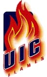
Fumblerooskies wrote:How do you like your FLAMES??

Image

Image

Image

Image

Image

Image
Don't forget the Calgary Flames...

Image
By kentuckywildcats
Registration Days Posts
#132310
#1 - Image - This one is just sweet from the color, to the panther, to the text.
#2 - Image - I like the text a lot and i like swords
#3 - Image - bird is pretty cool looking in my opinion
#4 - Image - a chicken, but they pulled it off really well
#5 - Image - the text is freaking awesome
#6 - Image - best of the rest, not flashy, but it's simple and not BORING like the 4 below
#7 - Image - colors is the only reason it's this high
#8 - Image - simple but boring
#9 - Image - that dog looks like the logo for about 25% of all schools in america with a bulldog logo...
#10 - Image - one of the ugliest, least creative, and most outdated logos i've ever seen in my life
User avatar
By RubberMallet
Registration Days Posts
#132381
LUconn wrote:
Hold My Own wrote:
RubberMallet wrote: it is outdated

How in the world is our logo outdated????????


If anything it's to futuristic compared to everyone else's
He views it as a "tribal" logo. And if the tribal arm band tattoo is any indicator, that is certianly not cool anymore. I've never really viewed it like that. I've always seen it as flames incorporated into an eagle. Someone acutally had to tell me that it's got tribal elements, before I noticed it. I guess it all depends on how you saw it for the first time.
thats exactly how i see it really. most people in the sports "rings" i know know i went to liberty...most of them have said, "you guys have that tribal tatoo logo"...i reply, "i know" its how other people see it...

if you are not familiar with tribal tattoos go spend some time in a gym...

i'm not saying its terrible...it just won't stand the test of time...
User avatar
By RubberMallet
Registration Days Posts
#132383
i always thought a pheonix type logo (with an eagle bird shape) would be cool. considering most associate pheonix's with fire...
User avatar
By RagingTireFire
Registration Days Posts
#132400
RubberMallet wrote:
Hold My Own wrote:Our logo is the best in the Big South...it's creative, edgey as well as something that can be taken into the future and wont be outdated
it is outdated
You're outdated.
By SuperJon
Registration Days Posts
#132405
Your mom.
By Hold My Own
Registration Days Posts
#132406
Isnt your avatar GI Joe? :lol:
By Hold My Own
Registration Days Posts
#132408
RTF: What era is your avatar from? :lol:

Seriously though I tried to remember what it was from...GI Joe or something...I know it's something from the 80's!
User avatar
By PAmedic
Registration Days Posts
#132431
Cobra Command: GI Joe's nemesis
User avatar
By RubberMallet
Registration Days Posts
#132486
RagingTireFire wrote:
RubberMallet wrote:
Hold My Own wrote:Our logo is the best in the Big South...it's creative, edgey as well as something that can be taken into the future and wont be outdated
it is outdated
You're outdated.
yeah good one....write that one down and save it for later
By ATrain
Registration Days Posts
#132488
RubberMallet wrote:i always thought a pheonix type logo (with an eagle bird shape) would be cool. considering most associate pheonix's with fire...
We're not Elon
User avatar
By RubberMallet
Registration Days Posts
#132490
correct. someone get this man a medal
User avatar
By flamesfilmguy
Registration Days Posts
#132527
So... i just noticed something. GW's mascot is the "Runnin' Bulldogs"... please tell me how that supposed to strike fear into the hearts of opponents when it seems like your mascot is "Runnin" away!
User avatar
By RubberMallet
Registration Days Posts
#132529
flamesfilmguy wrote:So... i just noticed something. GW's mascot is the "Runnin' Bulldogs"... please tell me how that supposed to strike fear into the hearts of opponents when it seems like your mascot is "Runnin" away!
really?
User avatar
By RagingTireFire
Registration Days Posts
#132562
flamesfilmguy wrote:So... i just noticed something. GW's mascot is the "Runnin' Bulldogs"... please tell me how that supposed to strike fear into the hearts of opponents when it seems like your mascot is "Runnin" away!
The worst thing for me about the G-Webb logo is that the bulldog appears to be trying to wipe its own butt.

Image

In fact, if you rotate it counterclockwise about 35 degrees and add some shag carpeting underneath it and the sound of my mom yelling "No! Bad dog! Dirty dog!", you'll have re-created every dog I ever owned growing up.
5 for 5 rule Meeting

Cause the troll owns it!!!!!!!! Play Basketball S[…]