Anything and everything about Liberty Flames football. Your comments on games, recruiting and the direction of the program as we move into new era.

Moderators: jcmanson, Sly Fox, BuryYourDuke, Class of 20Something

User avatar
By BJWilliams
Registration Days Posts
#375122
Not bad on the uniforms RVA. that I think would look great with the blue helmets (maybe a thin white stripe on either side of the red stripe on the helmets
By creeper101
Registration Days Posts
#375131
Why not have the side say Flames in cursive like the Florida Gators...That would be so dope! Red letter with white trim for the blue helmets and Red Letters with Blue trim for the white!
User avatar
By RVAparks
Registration Days Posts
#375142
Thanks BJ, the first white one is my favorite.
creeper101 wrote:Why not have the side say Flames in cursive like the Florida Gators...That would be so dope! Red letter with white trim for the blue helmets and Red Letters with Blue trim for the white!
Because we are not a high school or a chain burger restaurant

Image
By LUconn
Registration Days Posts
#375144
Red and Blue together on a uniform looks like a clown costume. The primaries have to be white and either blue or red with the other one just for accent. I prefer blue since everybody else should be wearing red
User avatar
By Sly Fox
Registration Days Posts
#375145
creeper101 wrote:Why not have the side say Flames in cursive like the Florida Gators...That would be so dope! Red letter with white trim for the blue helmets and Red Letters with Blue trim for the white!
Phil Basso called and wants his helmet back.
By creeper101
Registration Days Posts
#375146
just an idea.....The one we got looks dumb and Lu on the side would look dumb and an L? would look terrible!
User avatar
By RVAparks
Registration Days Posts
#375147
LUconn wrote:Red and Blue together on a uniform looks like a clown costume. The primaries have to be white and either blue or red with the other one just for accent. I prefer blue since everybody else should be wearing red
I forgot to display the other pair of pants when I was taking screenshots, my bad.

Image
By Chippy
Registration Days Posts
#375217
RVAparks wrote:
LUconn wrote:Red and Blue together on a uniform looks like a clown costume. The primaries have to be white and either blue or red with the other one just for accent. I prefer blue since everybody else should be wearing red
I forgot to display the other pair of pants when I was taking screenshots, my bad.

Image
I like. I would still prefer the stripe that we have on our blue helmets it's not as boring as Nebraska's or Penn State's.
User avatar
By El Scorcho
Registration Days Posts
#375251
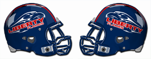
Our logo doesn't scale. It looks okay when it's huge, but it's useless when it's small. Ever seen it on TV when they try to squish it into one of those little boxes next to the team name? You can't even tell what it is. It's mostly white with words too small to read and some red squiggly lines. Everyone else's works or they provide a suitable alternate logo for such things. Not us. Dated flaming eagle all the way!

I've become used to it, but it still bothers me that we use it where it just doesn't work. Like the side of our helmets. The Boise St. idea of scaling it up to fit the helmet is the only thing that would work for it, but you'd have to ditch other parts of the logo including the name.

And FYI: The University's official Brand Identity Guide outlines the uses of the monogram logo. It's only used as an alternative for the full University Wordmark.

Wordmark: http://www.liberty.edu/promotionalpubli ... ?PID=14585

Monogram: http://www.liberty.edu/promotionalpubli ... ?PID=14585

Athletics logo: http://www.liberty.edu/promotionalpubli ... ?PID=14587

There is the alternate "Solitary Eagle", which could be used for the Boise St.-style helmets I suppose.

Our helmet logos just really bum me out.
User avatar
By RVAparks
Registration Days Posts
#375282
LUPunter0105 wrote:Here is several uniforms I worked on on Nike's site:

http://niketeam.nike.com/us/en_us/?l=sh ... 4FCIHCUHP0
Good work. I don't really like any on the first page, more of a fan of the "traditional" unis. Some of them are just too busy and remind me of the WNBA, haha. I like #s 5, 8, 9, & 10. #s 6 & 11 remind me too much of Syracuse.
User avatar
By BJWilliams
Registration Days Posts
#375295
RVAparks wrote:
LUPunter0105 wrote:Here is several uniforms I worked on on Nike's site:

http://niketeam.nike.com/us/en_us/?l=sh ... 4FCIHCUHP0
Good work. I don't really like any on the first page, more of a fan of the "traditional" unis. Some of them are just too busy and remind me of the WNBA, haha. I like #s 5, 8, 9, & 10. #s 6 & 11 remind me too much of Syracuse.
Maybe because thats exactly who he modeled them after...just a thought...
User avatar
By RVAparks
Registration Days Posts
#375312
BJWilliams wrote:
RVAparks wrote:
LUPunter0105 wrote:Here is several uniforms I worked on on Nike's site:

http://niketeam.nike.com/us/en_us/?l=sh ... 4FCIHCUHP0
Good work. I don't really like any on the first page, more of a fan of the "traditional" unis. Some of them are just too busy and remind me of the WNBA, haha. I like #s 5, 8, 9, & 10. #s 6 & 11 remind me too much of Syracuse.
Maybe because thats exactly who he modeled them after...just a thought...
WNBA? or Syracuse? kidding...

I like SMU's jerseys. I think they would look sharp in our color set. Of course they are an Adidas school though.
By LUPunter0105
Registration Days Posts
#375321
Yeah, that is the Nike Syracuse design template. I did some of those because I think we need something that is our own. Everything we do is based off of what UVa does. Hopefully, with Gill coming in, that will change. The uniform I wore was ugly, but at least it was original. (And the red ones were not all that bad)
User avatar
By RVAparks
Registration Days Posts
#375323
LUPunter0105 wrote:Yeah, that is the Nike Syracuse design template. I did some of those because I think we need something that is our own. Everything we do is based off of what UVa does. Hopefully, with Gill coming in, that will change. The uniform I wore was ugly, but at least it was original. (And the red ones were not all that bad)
Gill let his team wear those powder blue throwbacks this year, so maybe there is hope!

Image
User avatar
By Sly Fox
Registration Days Posts
#375333
LUPunter0105 wrote:The uniform I wore was ugly, but at least it was original. (And the red ones were not all that bad)
Image

Image

Image

I have the red one that belonged to Dom Bolden. It does look sweet ... but is not very flattering for my gut.
User avatar
By bluedevilflame
Registration Days Posts
#375385
creeper101 wrote:Why not have the side say Flames in cursive like the Florida Gators...That would be so dope! Red letter with white trim for the blue helmets and Red Letters with Blue trim for the white!
Like this? I love it, very classy!

Image

Image
User avatar
By R i
Registration Days Posts
#375439
The time is coming where we will pick one Logo. Put it on most everything, including the helmet.
By LUconn
Registration Days Posts
#375463
that's already been done. But the bookstore doesn't adhere to it.
User avatar
By Innocent Bystander
Registration Days Posts
#375479
Any interest in something like this only with the flames either in white outlined in red or vice versa?

Image
User avatar
By RVAparks
Registration Days Posts
#375482
Innocent Bystander wrote:Any interest in something like this only with the flames either in white outlined in red or vice versa?

Image
Ugly, brutal, disgusting... and many other words come to mind
User avatar
By Sly Fox
Registration Days Posts
#375487
Those look a great deal like the Delaware helmets that some school in South Canada ripped off.

:lol:
By bradyfan
Registration Days Posts
#375530
Innocent Bystander wrote:Any interest in something like this only with the flames either in white outlined in red or vice versa?

Image

I've come to find that, when it comes to uniforms, almost always will at least half of everyone hate them. I tend to give unique looking uniforms a chance. With that said, this is the ugliest design that I've ever seen for a helmet.
User avatar
By BiggAl57
Registration Days Posts
#375533
Innocent Bystander wrote:Any interest in something like this only with the flames either in white outlined in red or vice versa?

Image
I'm a Michigan season ticket holder (as well as LU) and even I find these extremely horrible.
  • 1
  • 2
  • 3
  • 4
  • 5
  • 6
  • 7
LU Campus Construction Thread

I thought years ago they thought about doing an up[…]

2027 Commits

Well played, Alabama24. I sat on a flight from OR[…]

Are we back?

Nice! Here is to hoping we can live bot free.