Anything and everything about Liberty Flames football. Your comments on games, recruiting and the direction of the program as we move into new era.

Moderators: jcmanson, Sly Fox, BuryYourDuke, Class of 20Something

User avatar
By adam42381
Registration Days Posts
#401309
El Scorcho wrote:Yes, BuryYourDuke. I'd want something LIKE that. It scales well. Compare it to their old helmet and it's an obvious improvement in how easy it is to grasp what you're looking at. Ours suffers from the same problem.

Let me try to illustrate. When the logo is displayed on a large area, it's perfectly readable.

Image

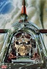
However, when it's displayed on a small area (such as a helmet viewed through a TV camera at the top of a stadium)...

Image

It's just not very apparent what it is you're looking at, much the less recognizable as the Liberty Flames logo. You certainly can't read it. There are tons of small details (like the eye of the eagle) that you just can't see from far away or unless the graphic is huge. The image doesn't scale down well.

By comparison, other helmet logos are usually something big, bold and instantly recognizable. They're also usually pretty simple designs. All of these things mean they scale down well and are still instantly recognizable at a distance, or when used as a small graphic on TV.

Examples:

Image

Image

Image

Image

Image

Image
Perfect examples of why you keep it simple and still make it unique. I can't think of one big time program that doesn't have a simple yet instantly recognizable logo.
User avatar
By BJWilliams
Registration Days Posts
#401316
There are I think two logos that LU could use for that purpose: the eagle head (and issues with scaling that are well documented on here) or the Fighting Sparky (which I dont think would look good on a helmet personally, but also may not be one that makes people instantly say LU in their minds either)
User avatar
By adam42381
Registration Days Posts
#401319
How about Liberty written in script similar to Cal? Maybe not the best choice, but it would be recognizable.

EDIT: Not as scalable, however.
User avatar
By Purple Haize
Registration Days Posts
#401328
adam42381 wrote:How about Liberty written in script similar to Cal? Maybe not the best choice, but it would be recognizable.

EDIT: Not as scalable, however.
The 70's called. They want their logos and polyester pants back :shock:
By NG33
Registration Days Posts
#401334
BuryYourDuke wrote:Yeah, I mean I love tradition, but we don't really have any. In the absence of tradition, I think innovation is the best thing you can do.
This.
By Chazzanator
Registration Days Posts
#401337
I think some kind of strip needs to be added to the white helmet.I'm not a big fan of the blue numbers on the red jerseys or the red numbers on the blue jerseys. It looks more like a high school team than a major college team. If we want to go big time, we need to dress the part.
User avatar
By bluedevilflame
Registration Days Posts
#401354
BJWilliams wrote:Not bad...Id tighten up that bottom part of the graphic but I like the thought
I thought so too, couldn't figure out how to do it! I think our logo is under utilized on the helmet, we've got a great logo, show it off! The only other thing I'd add would be a strip down the middle, and the best thing is, we could have this logo in red,white or blue, just change the color of the eagle.
User avatar
By PAmedic
Registration Days Posts
#401373
really good pics that I'm too lazy to post in the archives section of the Football Guide.

see: Kelvin Edwards

also some shots of the helmets using script. NOT scale-able. Yoiks.
User avatar
By jinxy
Registration Days Posts
#401381
I love that graphic with two additions

-the blue strips down the top that you guys have mentioned
-also i'd like to wrap the logo all the way around the back, give it the vikings or eagles look. Maybe the current blue ones do it but i've never been close enough to tell.
By jlread
Registration Days Posts
#401402
And do the Liberty in red Logo but use that red paint that has gold flake in it so it "LOOKS ON FIRE"...or some of that tape material like they use on road signs that is blinding at night when the light hits it.
User avatar
By Rooster Cogburn
Registration Days Posts
#401410
Or maybe use that cool fabric in the Unis from Hunger Games the movie so it looks like they are on fire while playing. Lololol

There is more uniform talk around here that football talk. haha
User avatar
By BJWilliams
Registration Days Posts
#401414
Chazzanator wrote:I think some kind of strip needs to be added to the white helmet.I'm not a big fan of the blue numbers on the red jerseys or the red numbers on the blue jerseys. It looks more like a high school team than a major college team. If we want to go big time, we need to dress the part.
I think a blue stripe, if done right, would be a good thing to add.

As far as the numbers, Id prefer the red or blue ones to white personally.
By jlread
Registration Days Posts
#401475
Rooster Cogburn wrote:Or maybe use that cool fabric in the Unis from Hunger Games the movie so it looks like they are on fire while playing. Lololol

There is more uniform talk around here that football talk. haha
Haha Sweet Idea. But since that's not available for purchase in our sector maybe we should just paint the Jersy's with that Hyper color so they turn red when the players heat up LOL like those tiedie Hyper color shirts from the 90's LOL
LU Campus Construction Thread

I thought years ago they thought about doing an up[…]

2027 Commits

Well played, Alabama24. I sat on a flight from OR[…]

Are we back?

Nice! Here is to hoping we can live bot free.